Contact
me@brentcairey.com.au
Ph: 0414 601 056

Blok

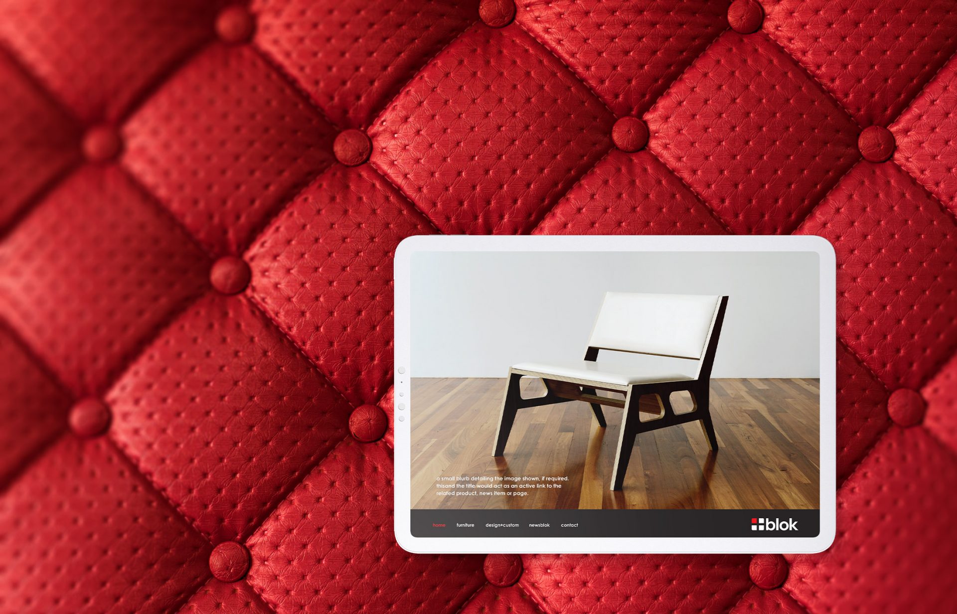
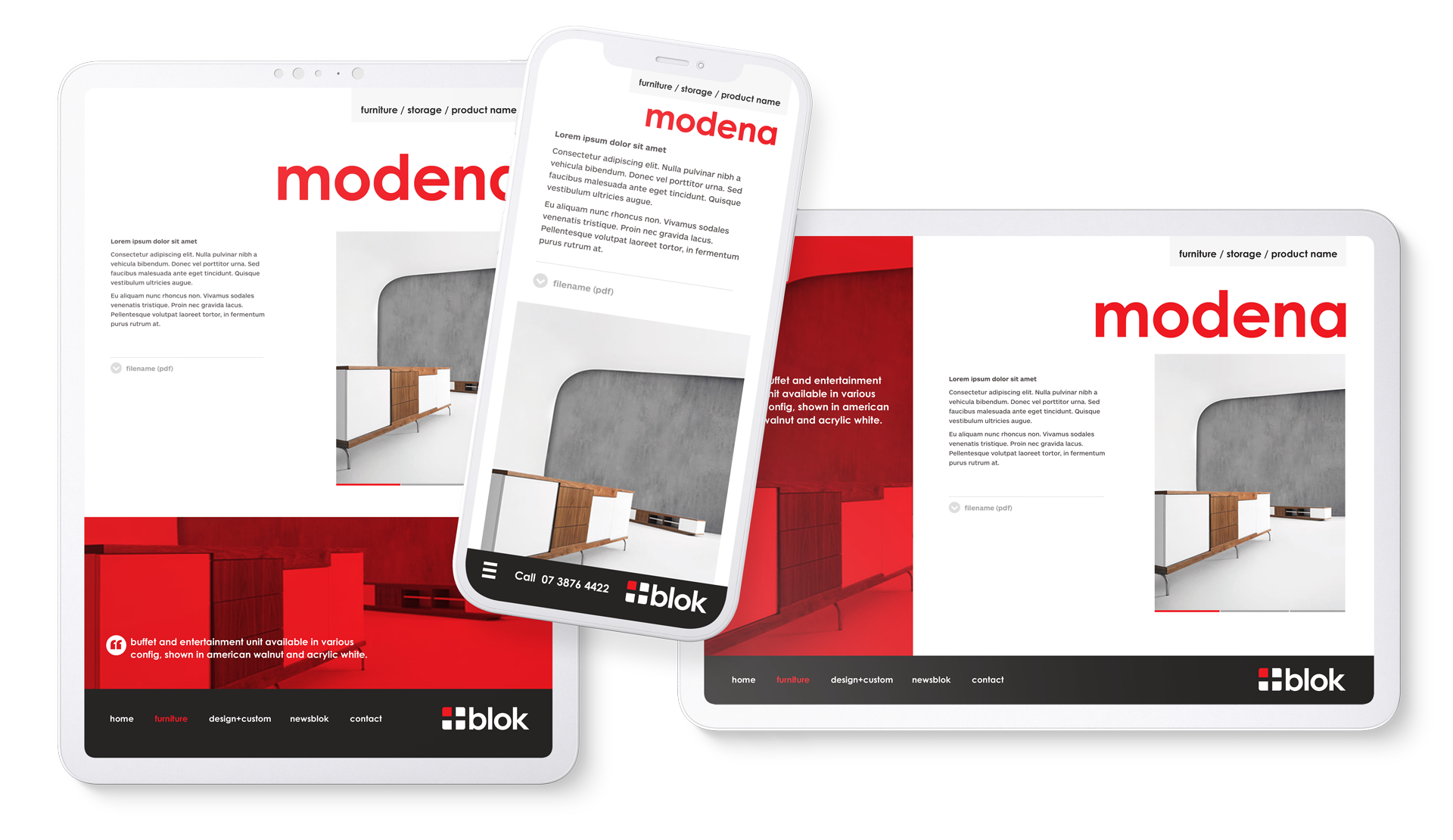
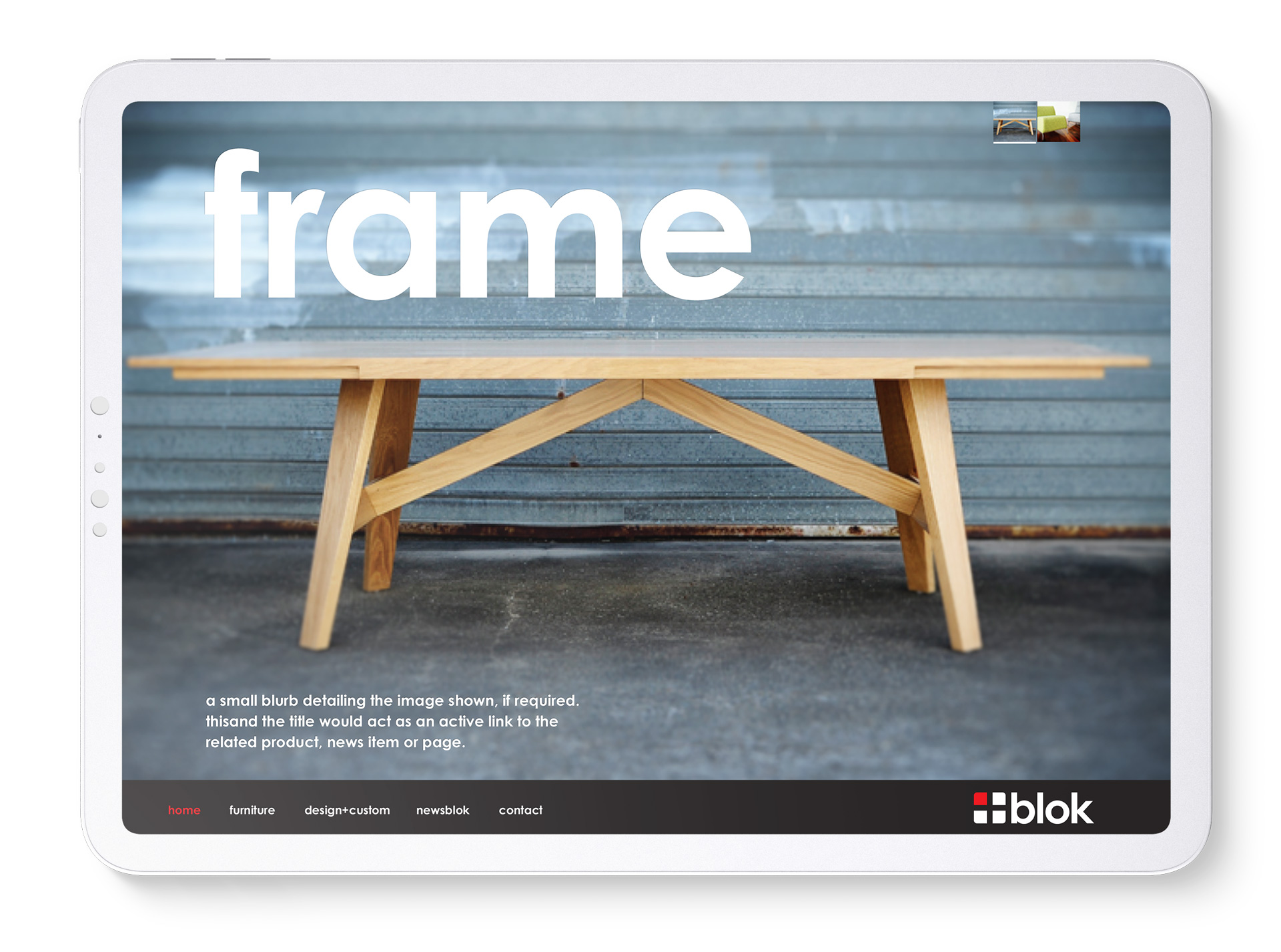
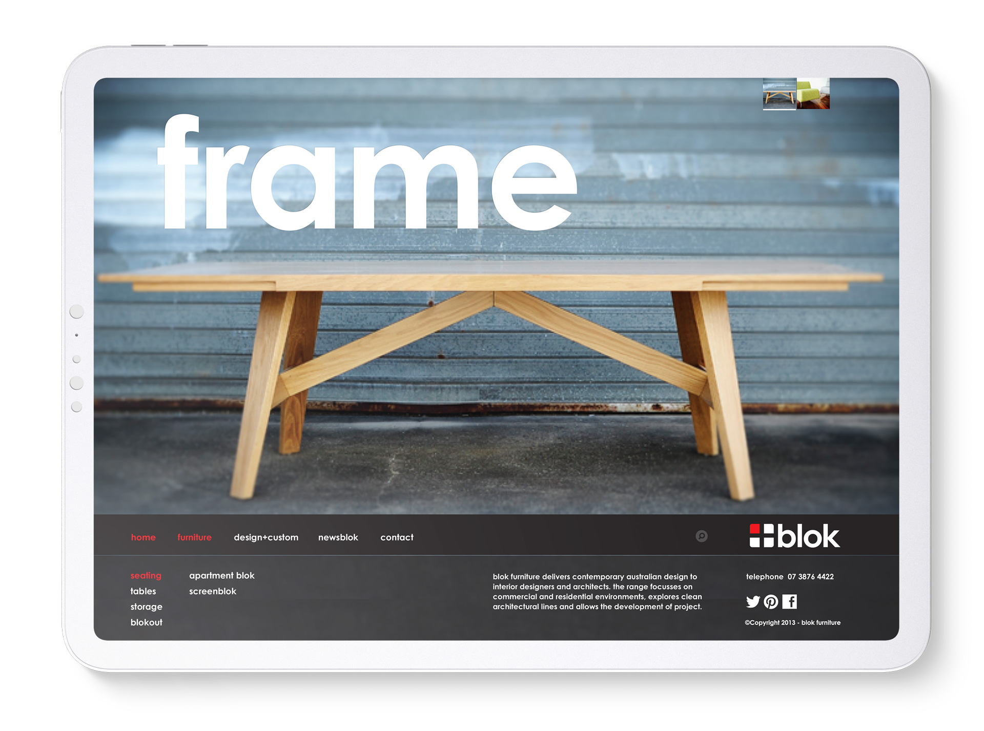
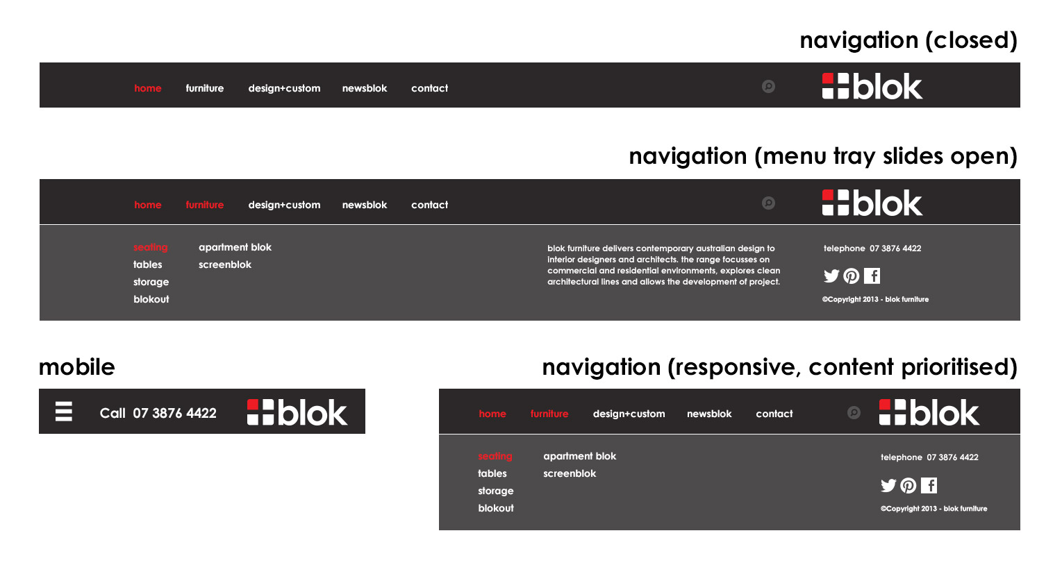
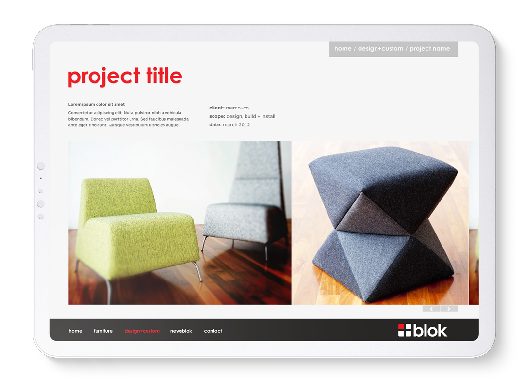
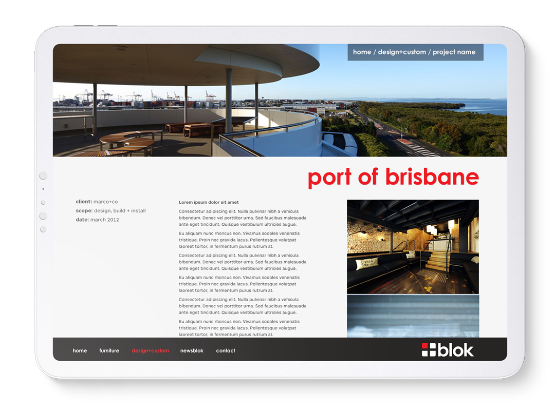
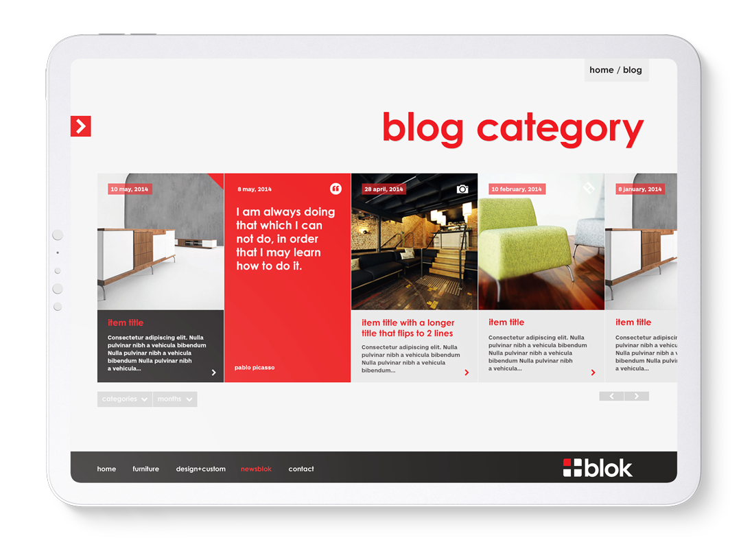
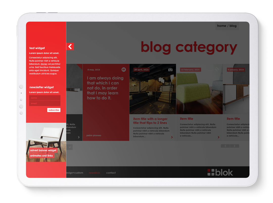
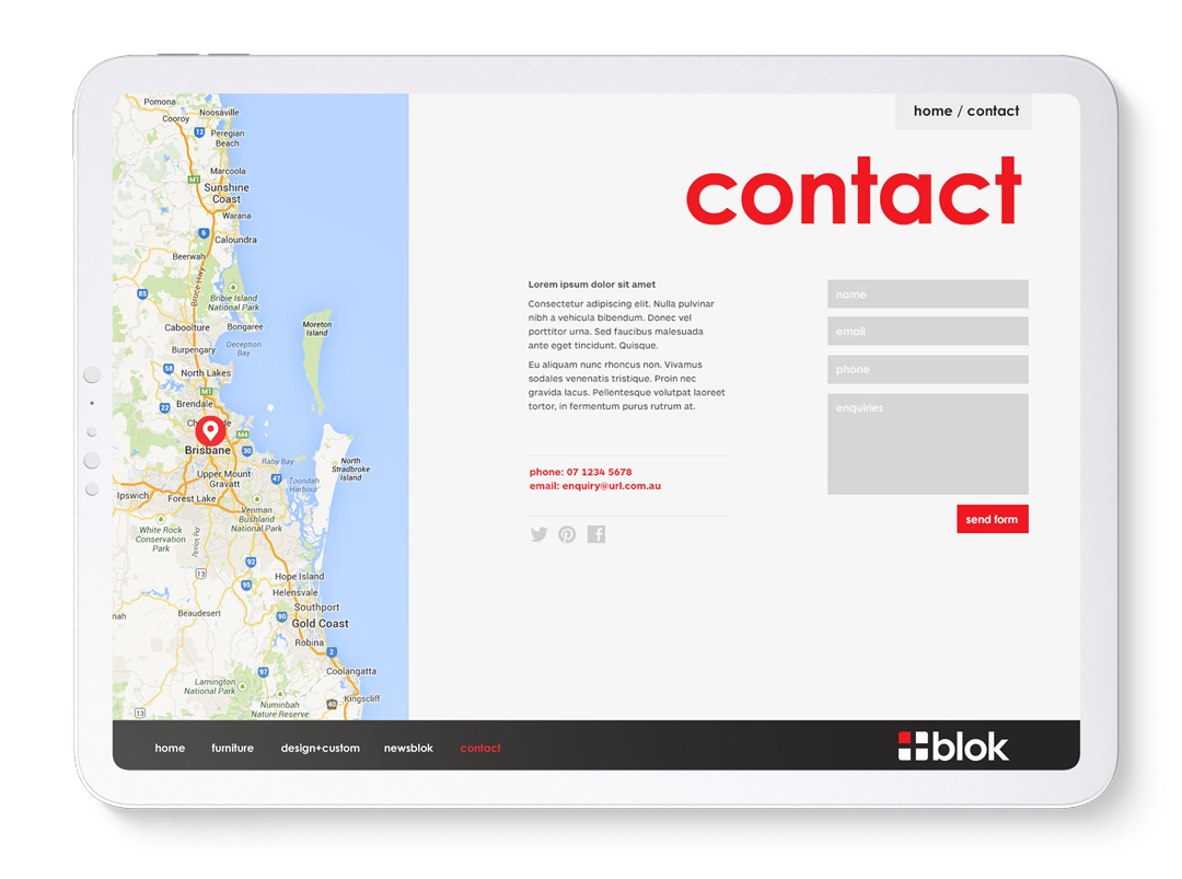
Blok were a boutique furniture designer and manufacturer. The designs were works of art and the site aimed at being a gallery with navigation being intuitively reactive to user selections, transparent when not needed.

Task

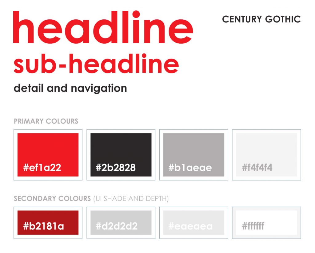
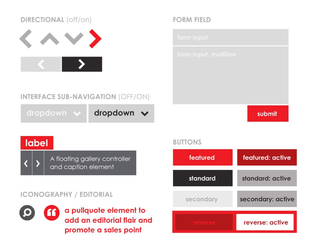
A minimal and modern UI, placing the brand and product design front and centre.

  • Strategy

    UI, UX, CX

  • Design

    UI/UX Design, Art Direction, CX

  • Client

    Blok

Challenge

With product designs this beautiful, the UI should disappear

Blok designed and manufactured some truly beautiful and premium quality furniture. 

Problem

How do you make an intuitive website which is both incredibly easy for the client to update and be a transparent experience to navigate for the end-user. 

Process

The site was to run on WordPress CMS, be responsive and support the brand aesthetic, making the product designs the hero elements. Minimalism takes a lot of work and thought to deliver. 

responsive layout
The layout was gracefully responsive to the user's device and orientation
Challenge

With product designs this beautiful the website should disappear

Blok designed and manufactured some truly beautiful and premium quality furniture. My initial belief was that the UX should be like visiting an art gallery, with the UI showing the bare minimum, intuitively responsive to the user’s interaction.

Problem

How do you make an intuitive website which is both incredibly easy for the client to update and be a transparent experience to navigate for the end-user. 

Product like this is a lifestyle want rather than a basic need, therefore reinforcing a sense of premium quality and artistic integrity was important.

Process

The site was to run on WordPress CMS, be responsive and support the brand aesthetic, making the product designs the hero elements. Minimalism takes a lot of work and thought to deliver. 

A great deal of thought and discussion with the developer around functionality and the required script and asst load required. The experience is of course affected by the page load times and the order items load can greatly affect presentation. Finding the compromise of function to form matters and having a working level technical of knowledge is in my mind absolutely required. 

Responsive navigation
The navigation used a sliding tray (up) to show secondary items while also removing tertiary info at smaller breakpoints

Research

Research ran throughout this process. From initial competition analysis through to interesting brands in similar design categories. 

Prototyping

This design went through multiple stages of design from initial hand drawn ideation through basic wireframes (for IA and user flow) through to high fidelity designs made interactive through Invision (I would use Figma these days). 

High fidelity mockups

This project allowed a range of page style designs to be created, all templated for the client to have total control over.

Having a range of templates gave the site a fresh feel, as each project or product could look different from the last, highlighting the best features of each. 

Minimalism and clarity

Design system

Briefly shown below, the design system was minimal aiming at clarity through the use of subtle tones.

The UI was there when a user wanted to navigate but sat in the background when the user was viewing the product. 

Flat colours and shapes presented the content with a sophisticated and timeless feeling.

Blok design system 1
Blok design System 2
Back

We use cookies like every website, by continuing to use the website you agree to the terms and conditions. Terms and Privacy Policy