About
Supply Nation provides Australia’s leading database of verified Indigenous businesses.
Problem
There really wasn’t a traditional problem for this project. What there was was a question about potential. Is there a product or platform idea that could both promote Supply Nation as an authority while also promoting engagement for sellers and buyers.
Process
From an initial conversation, working in consultation with an exceptional in-house developer I ideated the concept of how and why a platform may work.
Research
Research time was limited however there was a public website and brochure wear along with various corporate statements to gather and sift through.
Also some research time was put in to the industry Supply Nation aimed to support, to find potential insights from found sentiment.
Defining a solution
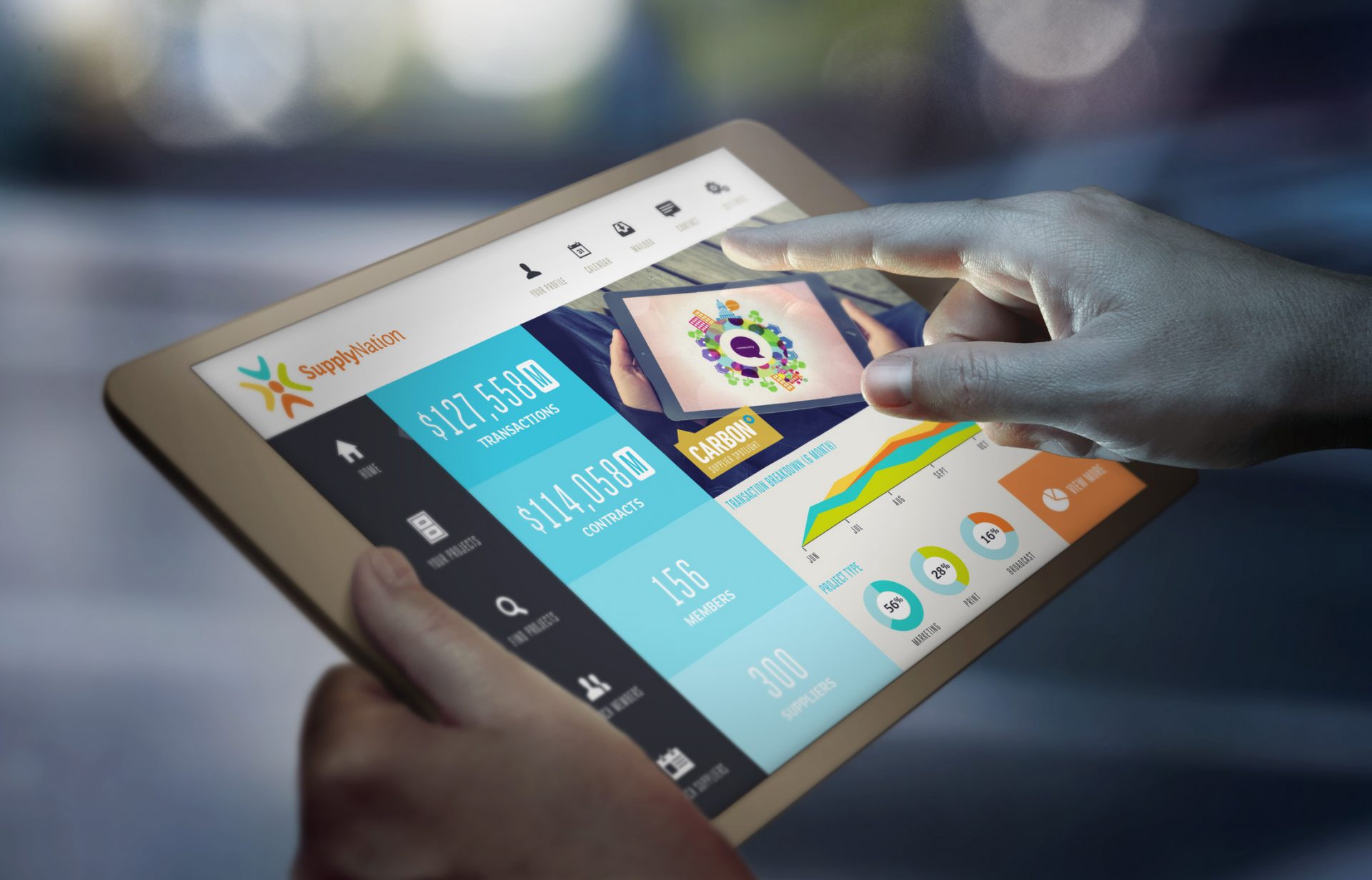
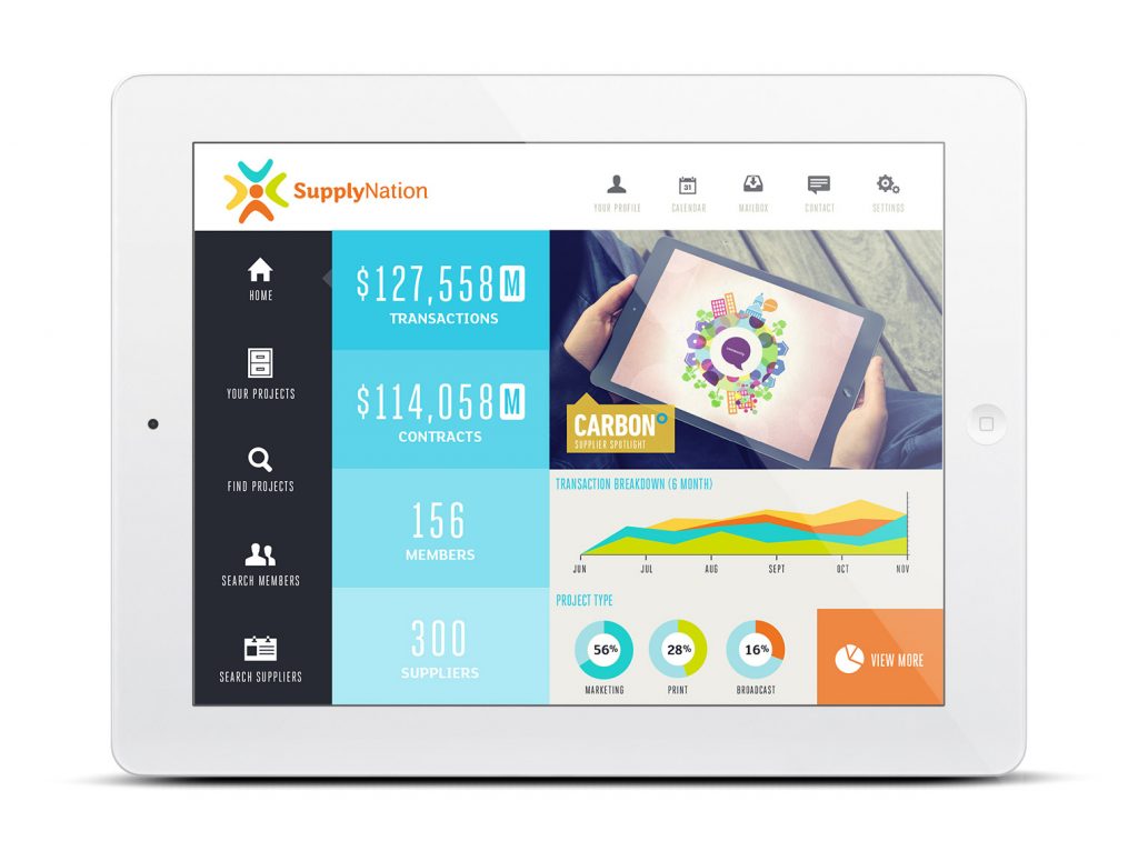
The proposed solution was to create a platform that heavily promoted the role of commerce. Rather than shy away from figures and speak in broader and perhaps ambiguous terms, the focus was on what value the platform offered the business community of Australia and for a logged-in member the value give to them specifically.
This was presented in large figures in a more friendly manner than expected, adding a visual value to fairly minimal content.
Wireframes
This was a fast concept delivery only. So no prototyping was required. However the standard practice of quick hand drawn wireframes helped me work through ideas and the discussions with the developer.
Design & design system
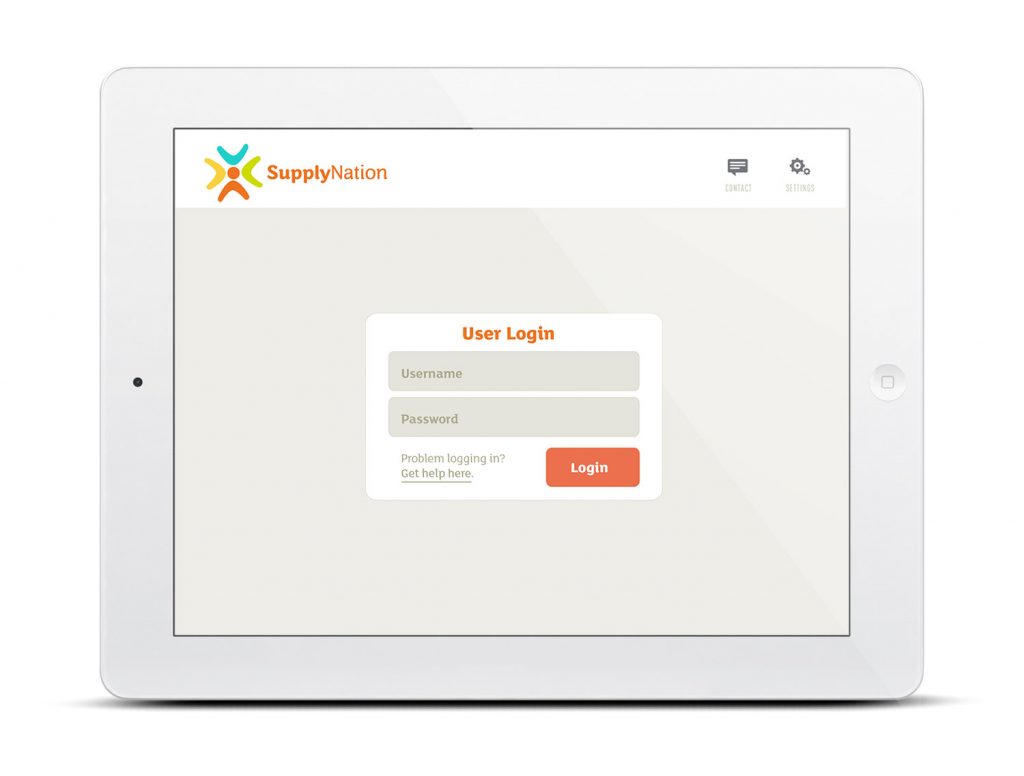
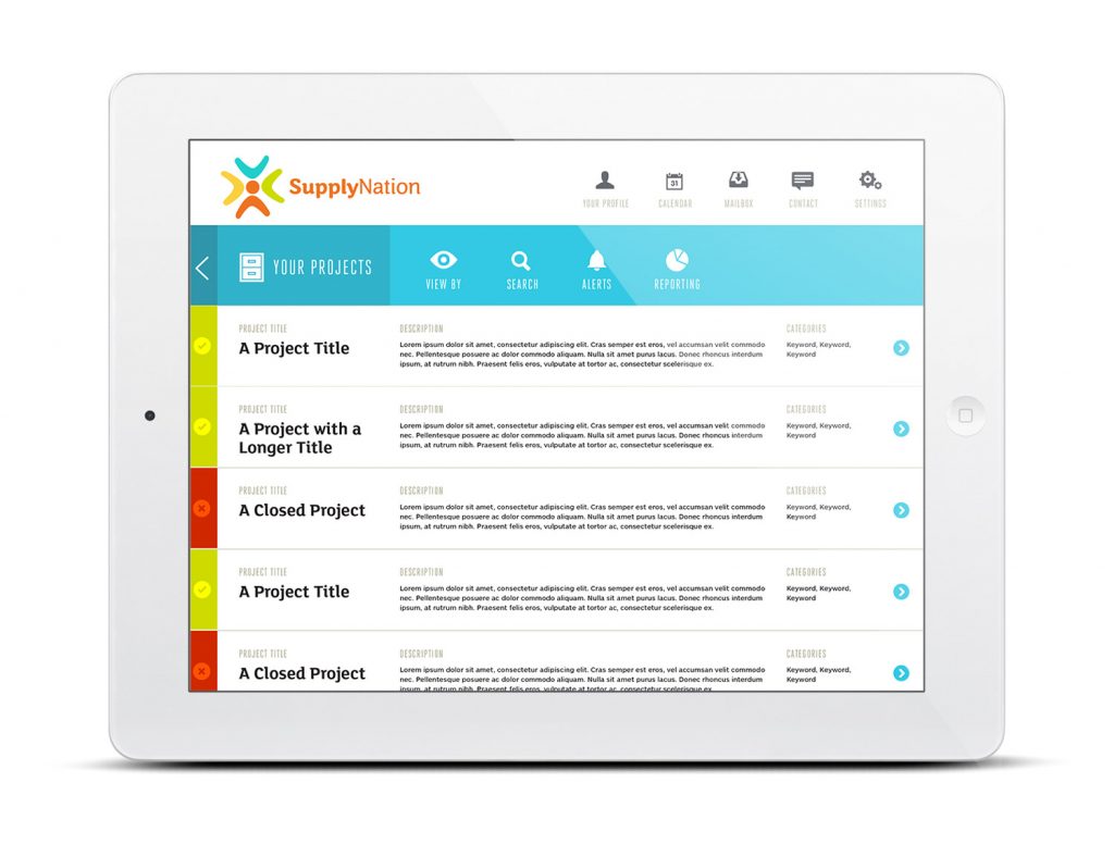
This was a fast concept delivery only. So no prototyping was required. Only a few high-fidelity visual mockups were required to sell the concept.
The design system although rudimentary for a concept only, used a friendly but very clean set of icons along with a colour palette that supported the 5 brand colours. The overall aesthetic was an interesting balance of clean and spacious while still friendly.
Takeaways
As with any project there are various learnings. For this I thoroughly enjoyed working with the in-house developer who could offer both technical insights but also a back-and-forth with creative ideation.
Being a fast concept delivery there wasn’t a great deal of time to consider all the options however a fast Scrum-style process between myself and the in-house developer enabled a concept that was visually and technically sound. This foundation of what was possible would have been a great start to a real platform project.
