Contact
me@brentcairey.com.au
Ph: 0414 601 056

Vision6

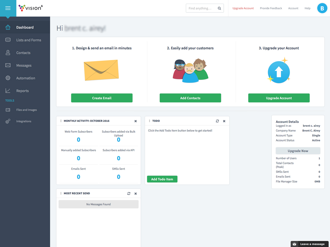
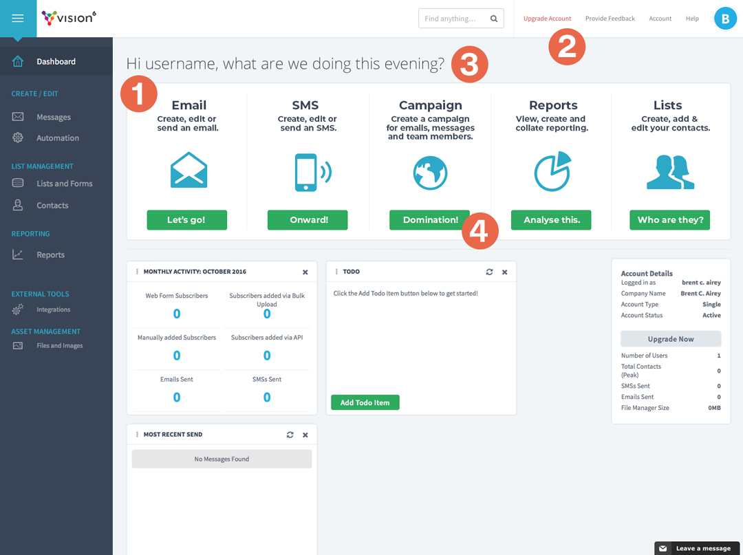
An opportunity arose to pitch some UX/CX improvements, as I saw them. The goal for me is to create a user-centric ‘sense of place’. My background in brand and visual design gives me experience is creating mood and tone of voice which I feel is important with the less obvious and harder to pin-down user experience in a digital space.

Task

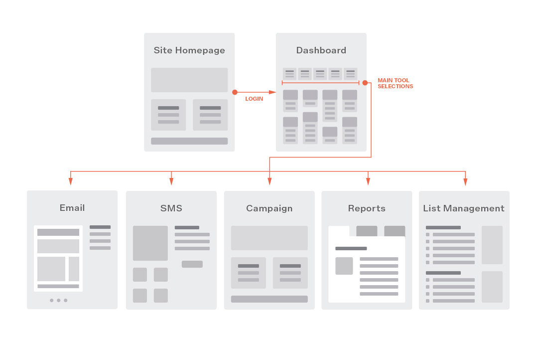
Using Human-Centered Design principles coupled with Google's HEART Framework look for some potential 'quick win' UX design choices to improve the CX user-flow.

  • Strategy

    UX, CX

  • Design

    UX/CX

Challenge

Focus on creating a user-centric 'sense of place'.

The ‘sense of place’ is simply the idea that when a user is in the tool they should feel like they know they are somewhere specific as opposed to feeling in the middle of a series of options. This certainty aims to help build confidence in the tool and an emotional connection to the brand.

Human-Centered Design (HCD)

Using several schools of scientific thought, such as data mining / analysis and behavioural science, UX strategy and design is an intuitive synthesis of gathered data, feedback (research) and experience.

UX and HCD is a consideration of how best to help real humans interact with your technology. How people think and process information matters.

It’s also important to acknowledge that you are a user too, not just a professional attempting to assist and exploit. Real understanding is helped enormously by experience.

User-Centric

Anything we deliver is going to be broadly ‘user-centric’ and the phrase does fall into ‘power word bingo’ territory along with terms like ‘paradigm shift’ and ‘synergise’. My approach to this, however, is to constantly aim to center the user in a sense of place.

A sense of place is ‘felt’ more than it is intellectually acknowledged and when done well isn’t even noticed. A very base example of this in web is the use of a breadcrumb bar. Given the nature of landing pages and search results, a user might enter the site via a mid-level page and a simple breadcrumb bar can visually communicate where in the site the user is. By helping a user acclimate faster you make the experience more comfortable and begin to gain their trust. You improve their experience.

1: Choice Architecture

Tasks and Pathways

User flow chart
By grouping and featuring the primary functions confusion is reduced and the user is greatly assisted in getting straight to work.

Through assisting the user with their tasks in this way we simplify their engagement, speed up their adoption hopefully make them happier and in turn strengthen retention, fulfilling the GV HEART framework.

The Problem

When a user logs-in to the platform they are presented with a dashboard offering a large range of options.  However, there is not enough of a delineation between what the user can do with the tool (tools) and what the user can do to the tool (preferences and platform personalisation). 

The Proposal

This proposal is simply to put focus on the functional elements of the tool, reducing confusion and empowering the user to make clear choices quickly. These choices are made obvious and assist the user’s sense of ‘place’ when there.

Personalising a tool is nice but the primary reason they are here is to use the tool for specific marketing goals. 

The Process

The first step here is to put a focus on the main functional choices offered and from there guide the user to the next dashboard or page that offers more information specific to that choice.

By offering a clearer sense of place a user can know where they are and what they can do there, like a series of sandboxes.

Most users will have stressors external to our tool and anything we can offer to reduce their stress is how we win them over faster.

  1. The focus is pulled to the tool’s functions rather than a mixture of functions and internal workings.
  2. ‘Upgrade’ is an upsell and is not of primary concern to the user.
  3. Perhaps adding an ‘Evening, today or morning’ variable based on the users time zone might add a personalised ‘team’ feel.
  4. The Campaign concept is simply allowing a user to group multiple Emails and SMS messages together for organisation and Reports when they relate to a specific campaign (seasonal, client, whatever).

Worth noting

‘Like with like’ navigation allows users to more comfortably understand what is available to them and how the choices relate.

The current list does use size to visually separate some elements which is great, but there is still a some confusion when looking at the left bar as to what is what and why it matters.

Some items may not be immediately used–if ever–by a user so sub-categorising them allows a user to mentally piece together what matters to them and what can be ignored.

This is also a good place to keep separating the choice of the tool and the setting to alter the tool itself (account settings, personalisation, etc).

2: Identity and collaboration

Roles

Illustrative user checklist

This is certainly nothing new to websites but in my experience agencies and businesses often leave content to an Accounts Manager or Office Admin person, which can increase risk and lead to stress for all parties involved.

The Problem

Presently if a team were to work on an email together it would be done through notes, comments and then someone having access to every editing option of the email.

What if you just wanted a copywriter to work on the copy but you were concerned they might accidentally edit the layout? What if that copywriter broke into hives at the mere thought of being in such proximity to HTML?

The Proposal

Create a series of roles with the applicable levels of ownership and editability that entails. Much like a website CMS this will allow a team to work on design and content separately in a streamlined method, also protecting the fragility of the design from ham-fisted, visually impaired team members.

User Roles allow multiple creatives and content editors to work on a project while maintaining control. An Author or Manager role might alone be able to send an email while various roles might allow sending trials? This option allows a campaign to have multiple creatives / content editors while maintaining a level of control confidence.

The wrap-up

Takeaway

Enterprise platforms are massive creatures with enormous potential for the gods of unintended consequences to join the party. 

While this opportunity didn’t eventuate it was a thoroughly enjoyable experience and at least shows some of how I approach UX and CX with the customer-first approach at the forefront. 

Back

We use cookies like every website, by continuing to use the website you agree to the terms and conditions. Terms and Privacy Policy