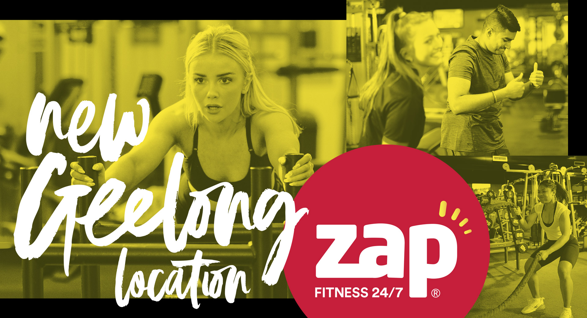
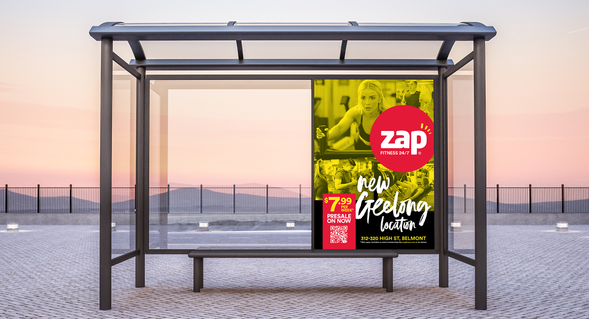
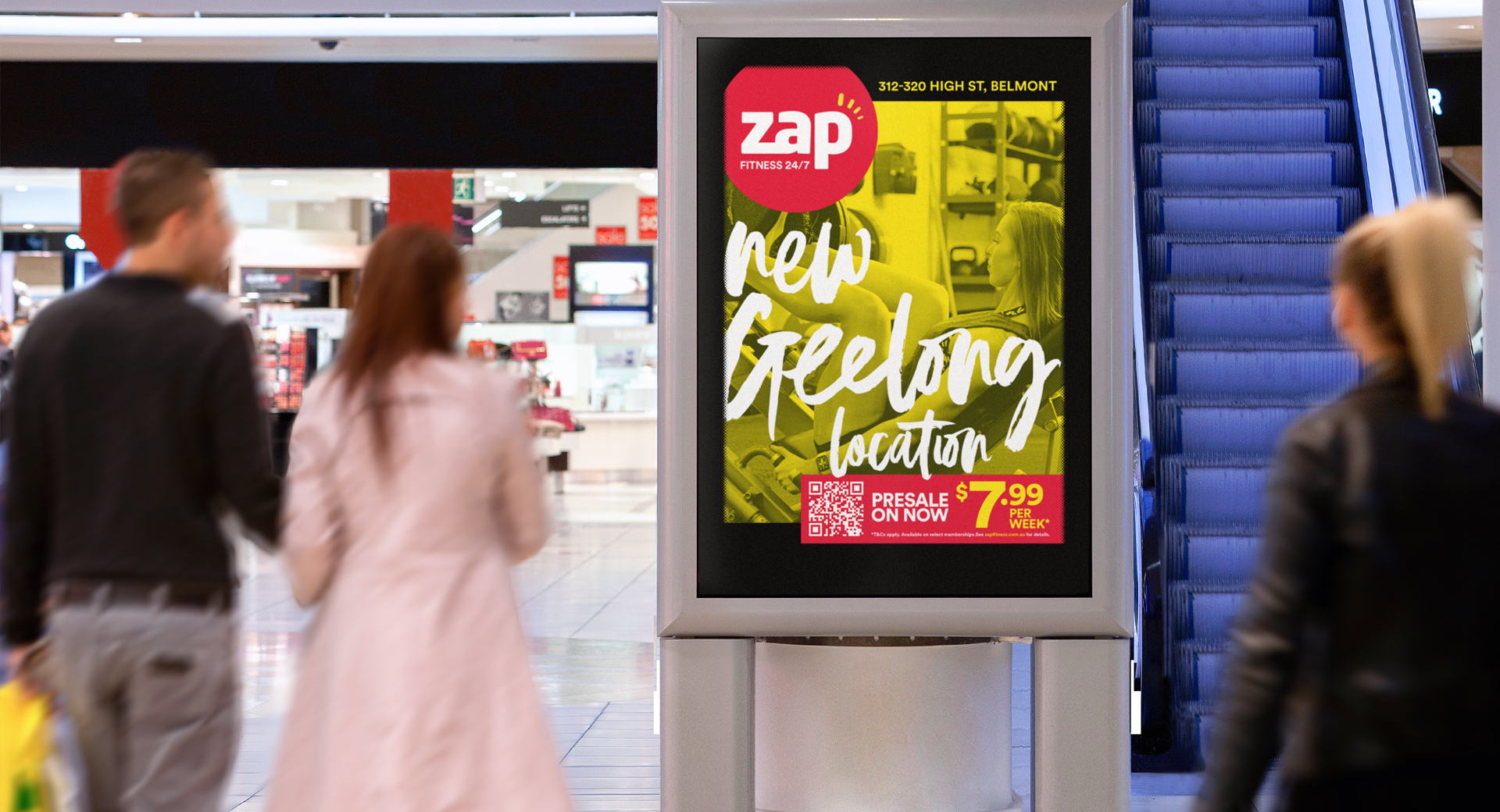
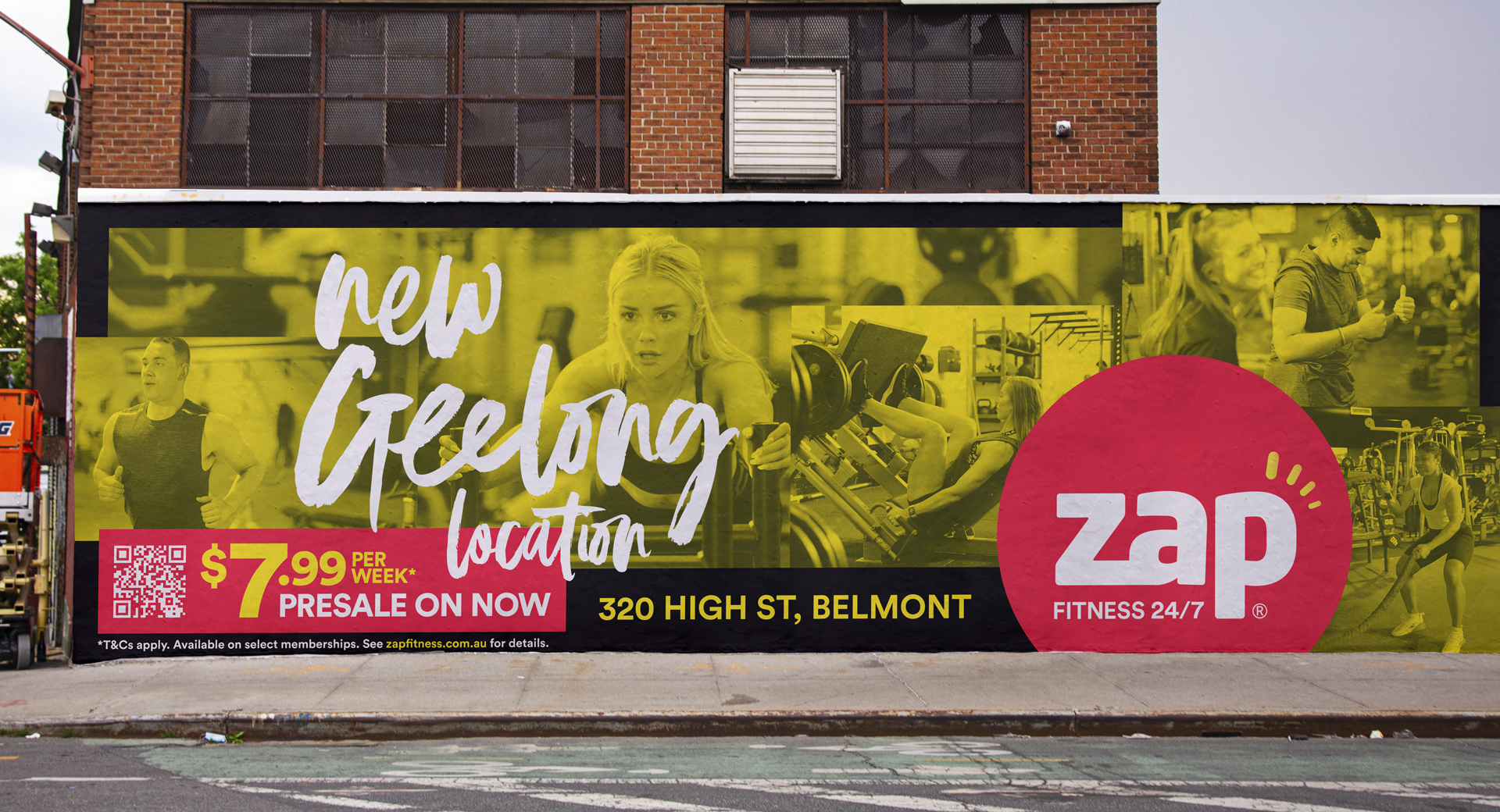
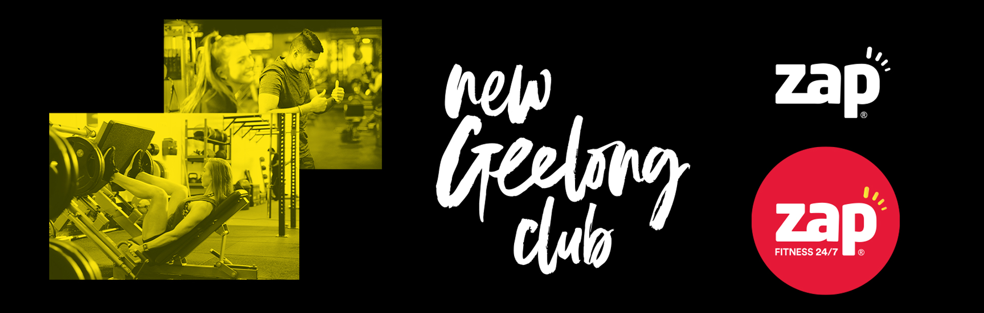
Contact
me@brentcairey.com.au
Ph: 0414 601 056

Zap Fitness Geelong

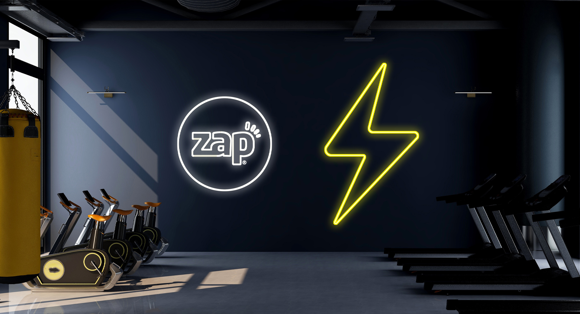
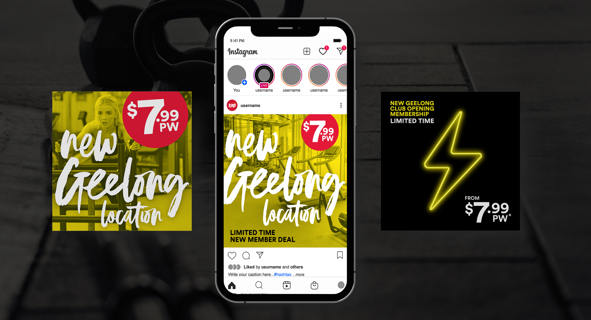
Zap Fitness opened a new warehouse gym in Geelong. This was a new concept gym for the brand they wished to go to market with a new look that stayed within the existing brand but evolved it in a more exciting direction.

Task

Create a brand extension with a campaign look and feel to go to market with an established but new brand in the area.

  • Strategy

    Brand, Campaign, Semiotics, Multi-channel, Digital Marketing

  • Design

    Brand, Digital assets, OOH

  • Client

    Zap Fitness

Brand Extension + Distinct assets

Evolving and stretching an existing brand.

Resetting opinions and standing out from the crowd while staying in-brand and in-category.

The Problem

It’s becoming increasingly difficult to stand out from the crowd of competitors. As new players enter the market, the convenience category continues to compete on proximity, price, and offering. All now expected standards for the category and not useful points of difference. While their brand distinctiveness is lacking through a sea of red, white and workout imagery.

The Solution

The Geelong concept club assists in competing with the product, price and service offering in the convenience category, while also giving the brand visual differentiation. The Distinct assets aim to present a non-category standard look while still addressing the category semiotics considered norms.

Foundational building blocks

Brand Extension Elements

Brand extension elements

There are three foundations to the Geelong Zap campaign: Images with an on-brand colour treatment creating distinct assets (as opposed to the category norm of HDR colour imagery) ‘Hero’ Typography using a friendly and loose brush script, and leaving the red logo to POP and effortlessly
stand out while also including a new stroke version of the logo for specific differentiation. 

Creating scope and uniformity

Logo Extension Variants

Logo variants

To create scope in delivery and to bring a consistency to various existing assets the approach was presented as:

The standard logo: Primarily for external comms and marketing. An evolved variation keeping the circle motif: external and in-club application. And finally a minimal ‘type and rays’ only version for in-club use.

Adding personality and mood

In-club neon brand elements

In-club neon branding

To allow for minimal yet impactful brand moments in-club the idea of neon stroke elements was used. These are kept to only a few per club and spaced out so as to create impact with understatement. 

Multi-channel static and video

Performance Assets

Back

We use cookies like every website, by continuing to use the website you agree to the terms and conditions. Terms and Privacy Policy