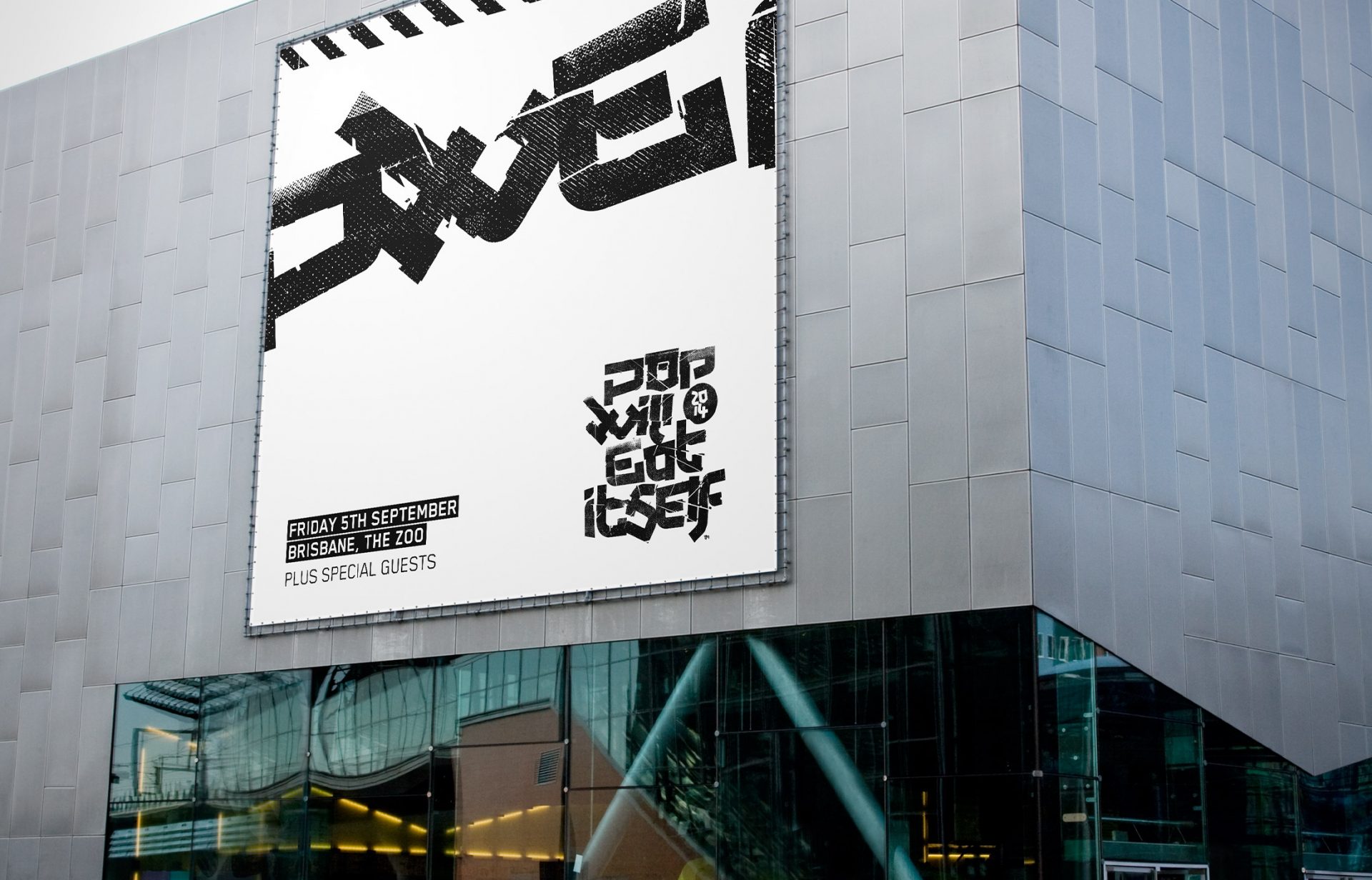
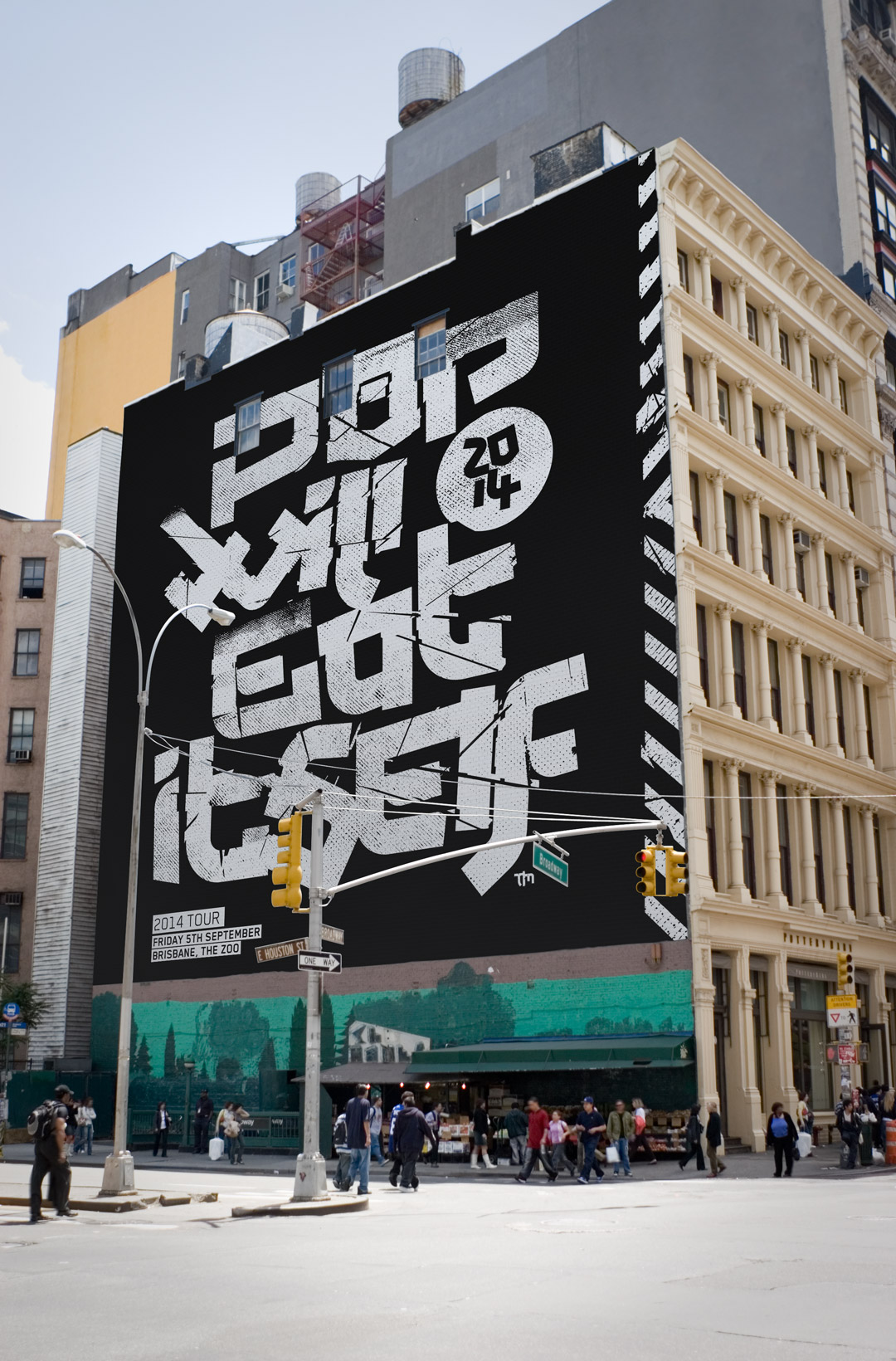
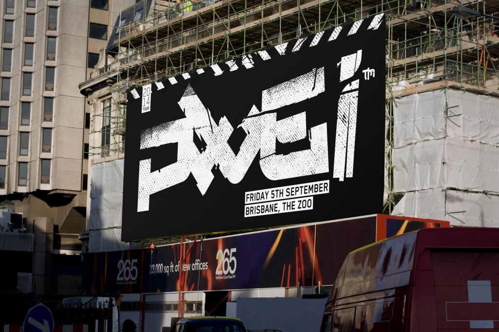
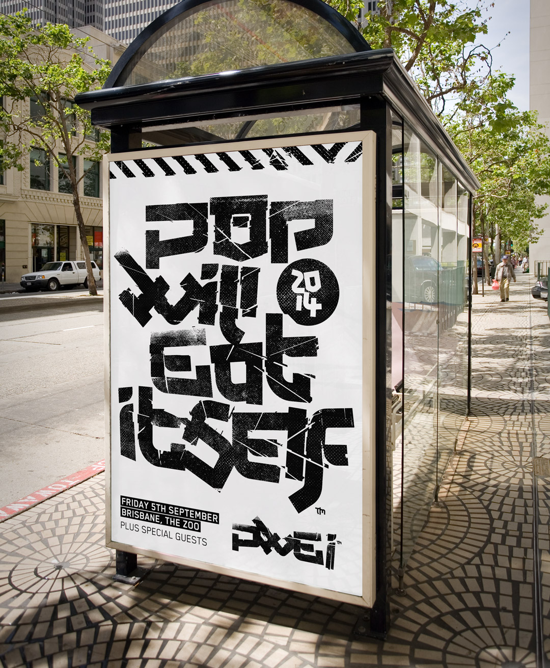
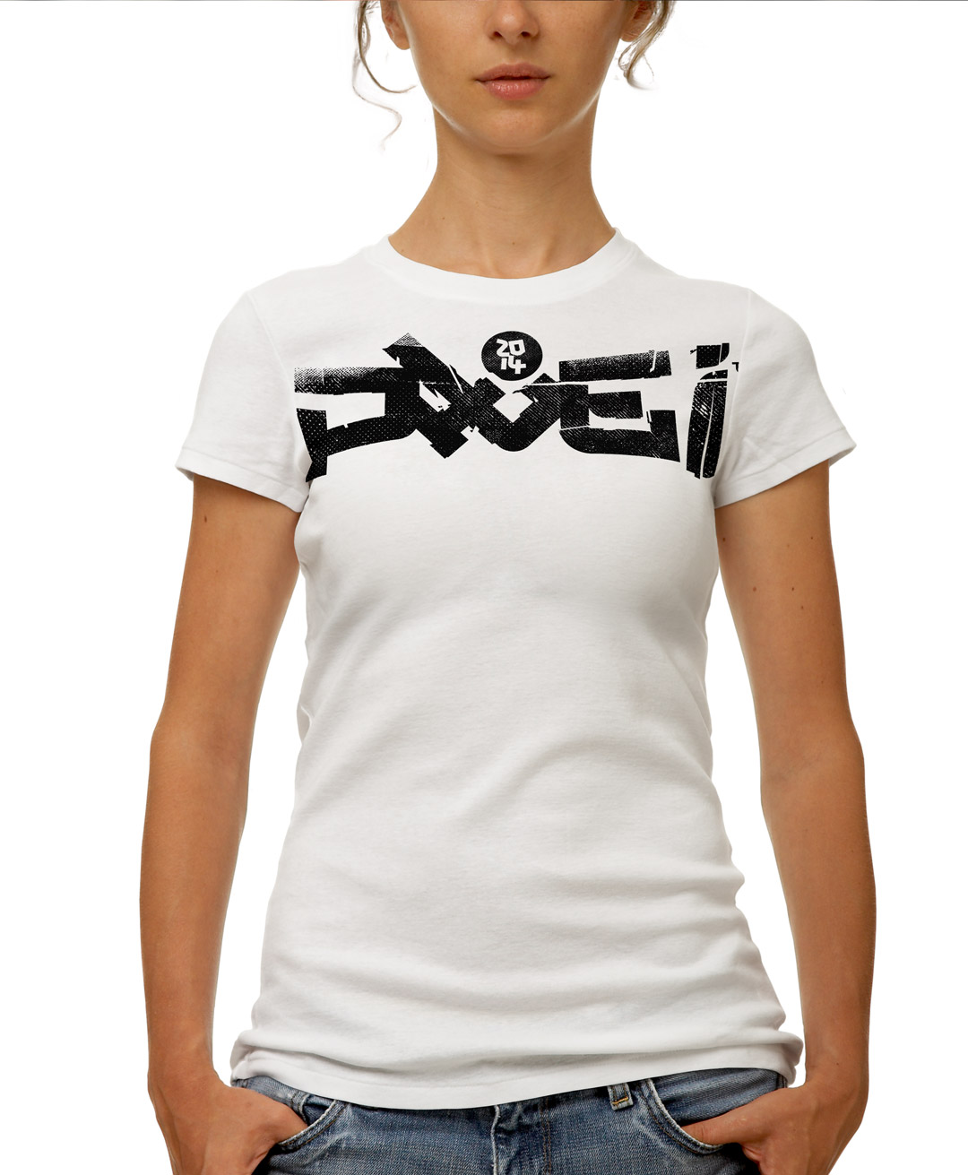
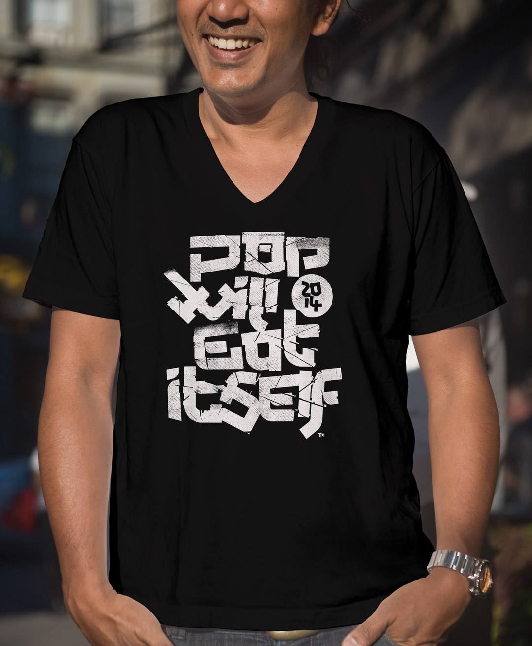
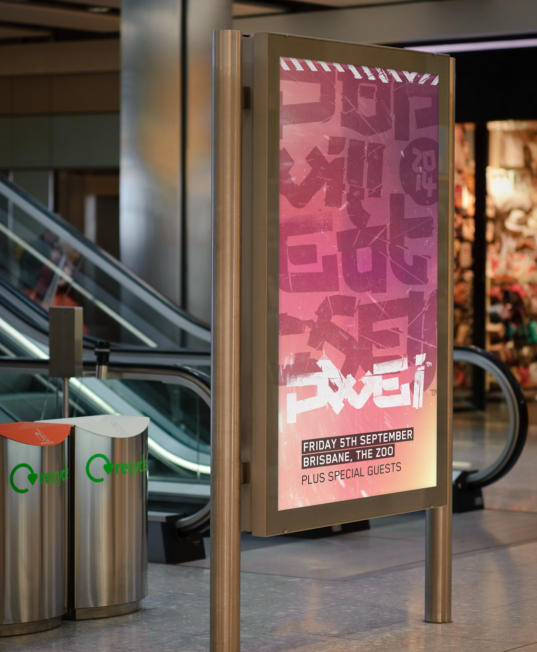
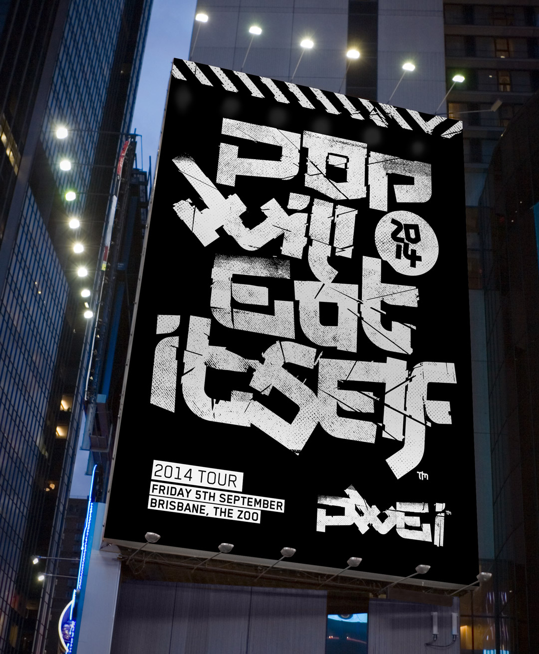
Contact
me@brentcairey.com.au
Ph: 0414 601 056

PWEI

The creation of a tour campaign design system aimed at allowing a fast asset delivery across any medium supporting geolocation specific personalisation . The loose, off-kilter style wrangled into order by a geometric font gave a futuristic edgy feel.

Task

The goal was to create a campaign tour design style which paid respects to the band's history and pushed into new territory.

  • Strategy

    Brand, Campaign

  • Design

    Art Direction, Design System, Font

  • Client

    Self

Opportunity

A campaign design system for a loved band. Isn't this why we do this?

The opportunity of presenting a campaign style and design system to the reformed band came about by chance.

The band’s artwork was designed by The Designers Republic (tdr) who were and still are a huge inspiration to me and enormously meaningful in the history of graphic and visual design.  

This was not used, sadly, but was an absolute joy to create. 

The use of both initial and full-name title options allows the band to preach to both the converted and the heathen. The noise added to the treatments show print screens, decay and digital, placing the treatment in the past, present and future.

Campaign

Design System

Built around the same concept as the popular Atom Design Methodology (not just for digital products) the brand is a collection of elements. These building blocks allow any designer or marketer to quickly build and deploy assets and collateral. 

Font presentation 1

Blender offers a modern and slightly futuristic feel while keeping a strong grid and modernist feel which gives a personality but not overly so, which means it won’t fight for attention with the logo. Blender works on and offline with available webfonts.

Warning strip options (bi and one directional) at large resolution allow the use of complete or sectional design use. 

Warning strip artwork

B&W are the primary colours. They are bold and offer great contrast. This does not exclude full colour but does allow a very strong visual communication in all environments.

Colour palette

The system proposed allows an infinite number of layout options which will not water-down the brand but instead embrace random chaos and in turn strengthen the brand through variety. Brand is a feel and a tone of voice, not a ridged set of rules. The range of flexibility of course depends on the brand and audience.

Billboard design
A system for strategy

The wrap-up

A brand’s ideation period usually includes potential design system elements as part of the overall look-and-feel. From this collection a feel and tone of voice is created and at a very basic utilitarian level the brand is easy and faster to deploy well.

Not matter how small a project an underlying design system is important. 

Although this project didn’t go beyond a pitch it’s one I very much enjoyed creation and still holds a special place for me. 

Back

We use cookies like every website, by continuing to use the website you agree to the terms and conditions. Terms and Privacy Policy